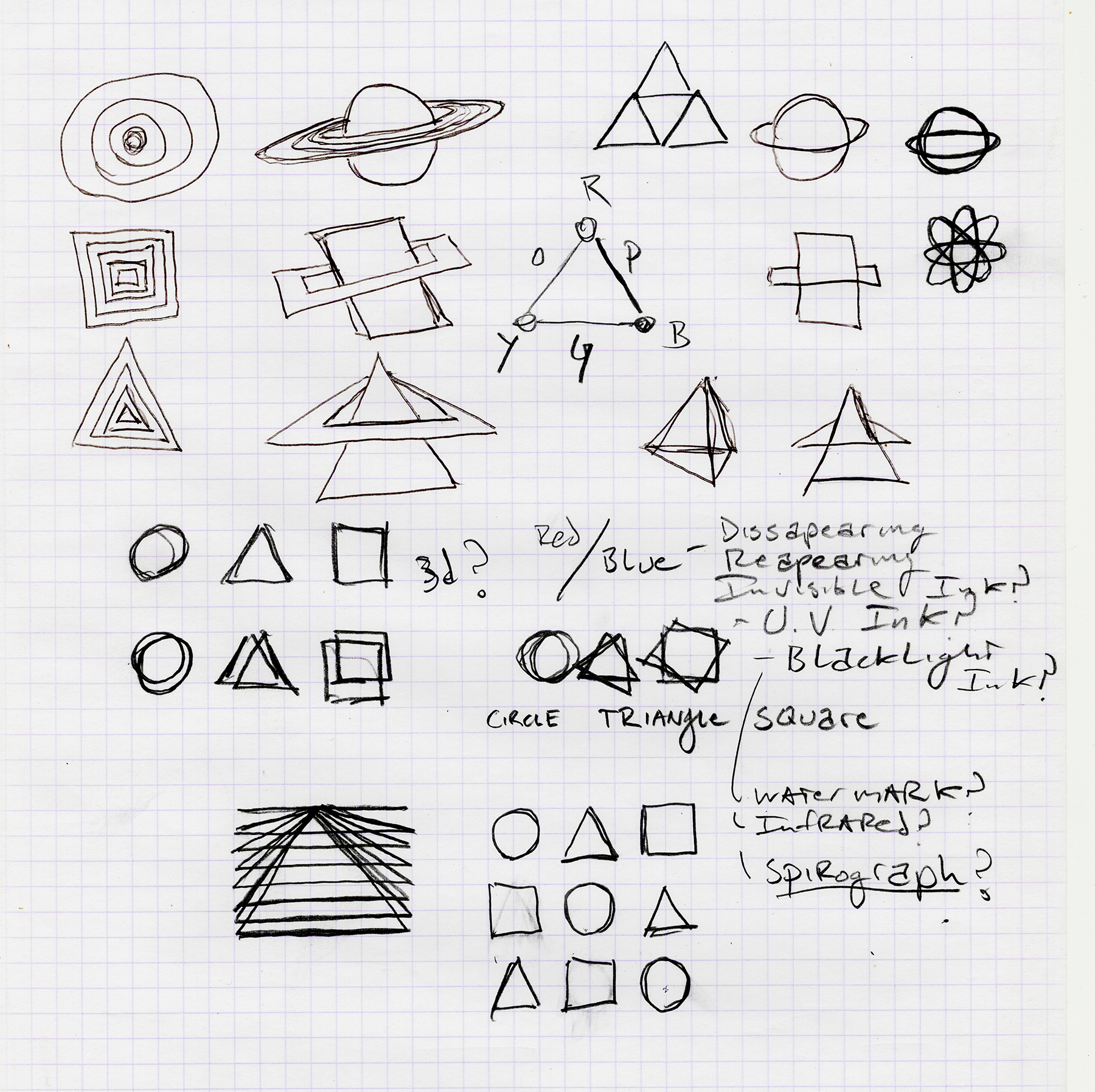
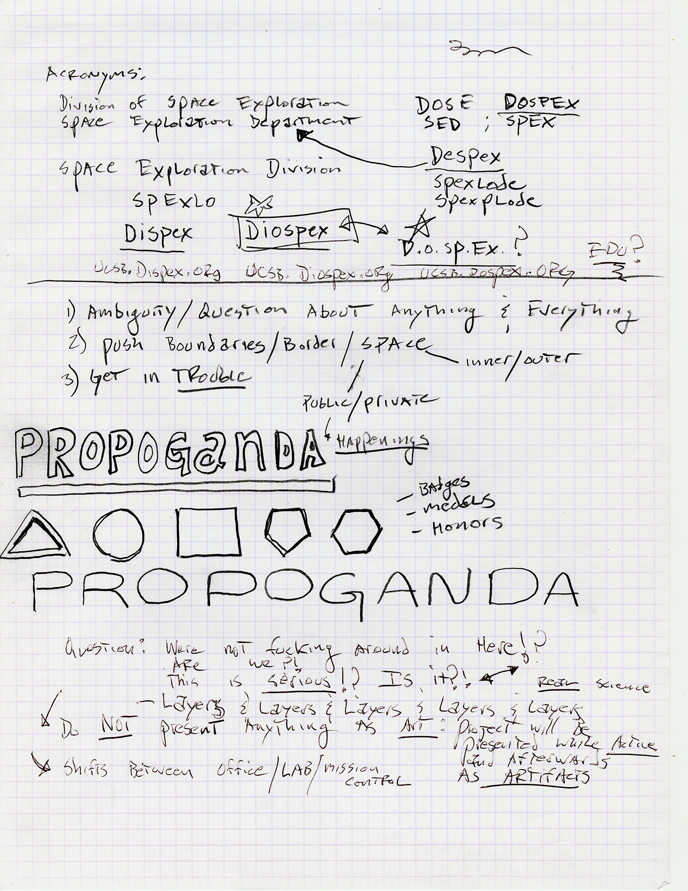
D I O S P E X (Division of Space Exploration) is an experimental personal brand and visual language that I created early in 2010. The emblems were meant to be ambiguous, playful/serious, and
to reference the logos of those mysterious science/engineering/tech companies who you're not quite sure what they are actually up to.
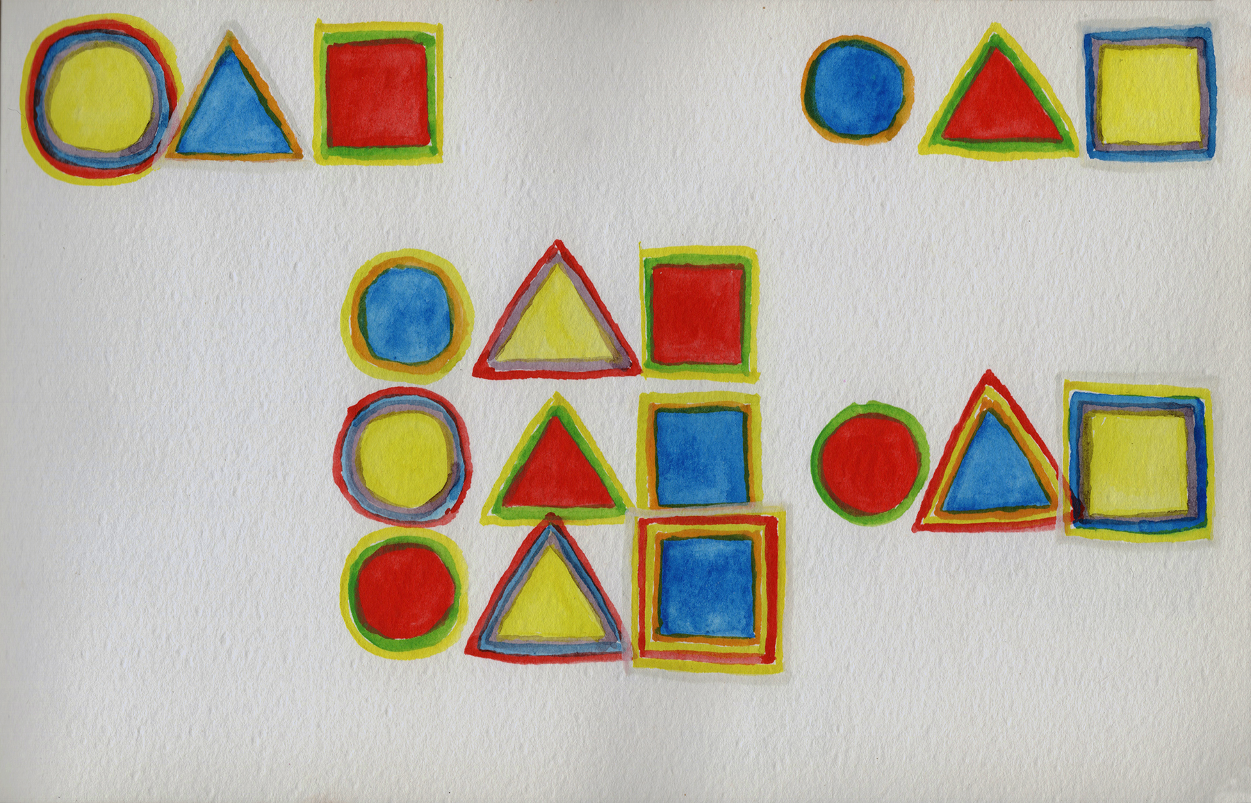
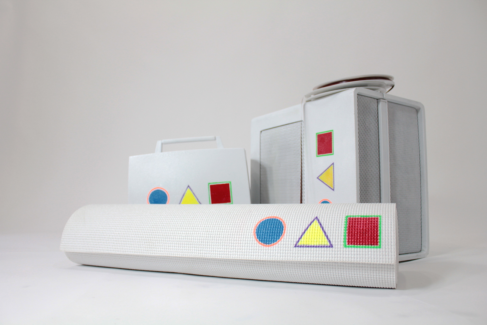
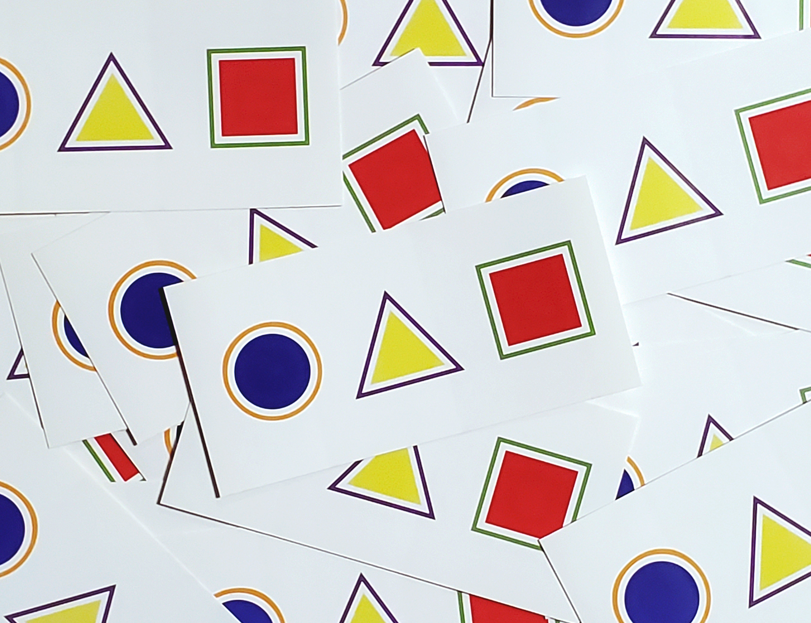
The final logo was based on a logical progression of form, and an intuitive sense of color. The shapes progress from a single-sided shape (circle) to a three-sided triangle
and then to a four-sided square. For the color study, primary colors were assigned to each shape, with each shape having a complimentary border color.
Coincidentally, my color study and final decision for the logo aligned with a historic 1923 survey conducted by Wassily Kandinsky with his students at The Bauhaus in Weimar, Germany.
Kandinsky distributed a color-form survey and asked his students to assign a color to each shape. The conclusion was that the color blue corresponds with a circle, yellow with a triangle, and red corresponds with a square.